How to Make the Most out of People Leaving Your Website
You’d like to think that people will stay on your website until they’ve absorbed everything you have to offer, but the reality is most will leave after the first page.
For whatever reason, a significant percentage of your visitors will bounce (bouncing is act of leaving a website after the first page you visit without any interaction).
According to this infographic on Bounce Rate by Kissmetrics, an average of 40.5% of people leave after the first page they visit.
So what can you show to the 40.5% of people that are going leave after the first page to reel them back in, what’s your hail Mary?
This is where exit intent popups come in, by showing a popup just as they’re about to leave you have a chance of turning a missed opportunity around.
Because not everyone that leaves after the first page is disinterested, a lot just need the right offer to convert into leads or customers.
By presenting an offer of value just before a visitor is about to leave, you’re making the most out of people leaving your website.
I’ve seen a lot of websites I’ve worked on see as high as a 12% increase in conversions just by implementing an exit intent popup.
So, what happens if you go about it the wrong way?
Many people swear against using any popups at all because they’re worried it will infuriate customers.
Popups can be aggravating it done badly, Google can even punish your SEO rankings for poor popups that ruin the user experience.
In January 2017, Google released an update punishing pop ups that ruin user experience.
What does this mean for someone wanting to use popups?
Practically, if your website is ruining the user experience for your visitors with popups, you will have trouble ranking as high in the organic search results.
This is especially true for mobile, where popups are often guilty of taking up the entire screen.
From this, you can understand why some people wouldn’t want to use popups.
What Google announced wasn’t black and white though, it just took a reasonable step in the right direction of making the web better for everyone.
So, popups can still be used, just avoid abusing them.
In fact, exit intent popups could be the best candidate for Google-friendly popups.
There’s a lot of resources that infer that the focus on the popup crackdown wasn’t exit intent popups.
The focus seemed to be more on popups that appear all the time to users after a few seconds of delay when visiting a page.
In a Google Webmaster discussion, John Mueller from Google confirmed exit intent popups are still okay.
So, what are the implications of exit intent popups being considered to still be okay?
The risk of being penalised by Google for using them is lower.
Therefore, they’re still a viable strategy to show people who are about to leave your website.
This isn’t a hall pass for making them like spam though, if you make the popup too obnoxious, too hard to click out of, or too persistent for people that visit your website multiple times, your SEO is still going to be punished because that’s plainly poor user experience.
I always follow a simple rule: If it will annoy me, it’s going to annoy someone else.
With the risks in mind, what are the advantages of using an exit intent popup?
Exit intent popups are great for increasing your conversion rate.
With this strategy, you’re converting people that would have otherwise not converted and optimizing your overall conversion rate.
According to these popup statistics by Sumo, the average conversion rate for all popups is 3.09%.
What does this mean for your overall conversion rate?
An extra 3.09% of conversions from the 40.5% that leave on the first visit could be a lot of sales or leads for a company with even a minimal amount of traffic.
Because of this, it’s easy to see why exit intent popups are great for increasing your conversion rate.
I’d recommend implementing one to any website that can offer something of value within the popup.
And this is just the average conversion rate.
If your popup is executed correctly, your popup’s conversion rate will be even higher.
The top-performing popups see a much higher conversion rate than the average.
The top 10% of highest-performing popups averaged at a 9.28% conversion rate (source).
How do you make your popup be in the top 10% of top performers?
It’s quite easy, the average is brought down by the sheer quantity of people who don’t follow best practices and create annoying, poor performing popups.
By just doing it correctly, you will easily be on above the average standard of popups.
This means you will reap a higher conversion rate than the average 3.09%.
If you though the average performing popups increase to sales or leads was great, you’ll be blown away by the increase you’ll get with a popup that’s done right.
I’ve implemented exit intent popups on plenty of different platforms and websites, it’s an easy way to increase the conversion rate.
Here’s how to implement an exit intent popup on WordPress, Shopify and in code. If you already know how to set up an exit intent popup in your website, skip ahead to my tips on how to turn your popup into a top performer.
How to set up an exit intent popup in WordPress
Setting up an exit intent popup on WordPress is easy.
All you need to do is install a plugin that does the job and they take all the hard work out of it, there’s a lot of plugins that do exit intent popups but my favourite is Yeloni Exit Popup.
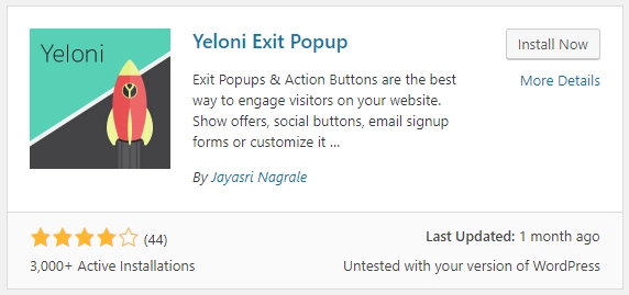
Simply search for the plugin, install & activate it, then you’ll be ready to make your exit intent popup.
After you select Yeloni from the sidebar, you’ll be presented with a list of designs to choose from.
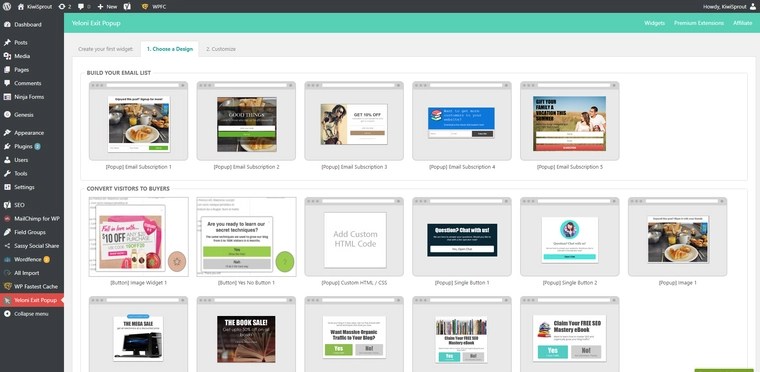
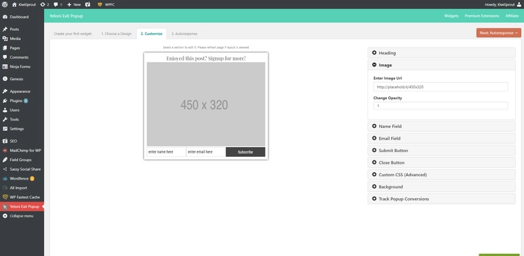
After you’ve selected a popup you’ll be taken to the customising screen, set up your popup on with the dropdowns on the right hand side and when you’re satisfied with the preview of it, hit next up in the top right.
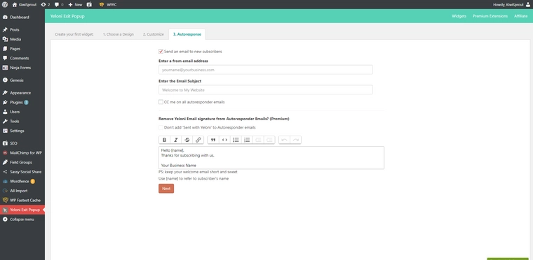
The next screen will ask you if you want to send out an email to people who fill out the popup, if you say yes fill out your email’s details then hit next.
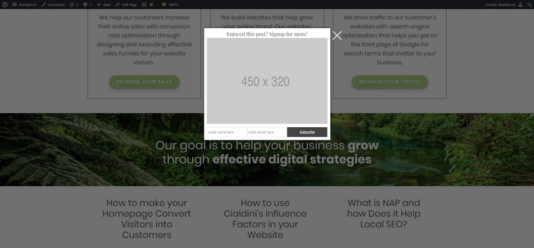
Give your new popup a name & save it, then you’re done!
How to set up an exit intent popup in Shopify
Setting up an exit intent popup on Shopify is pretty similar to WordPress.
Like WordPress, there’s plenty of apps to choose from to get the job done, I like to use MailChimp Forms by MailMunch.
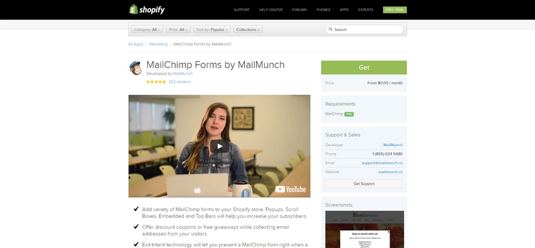
Search for the app & install it, then you’ll be presented with a few options for your form, select “popover”, then you should see a bunch of designs to choose from.
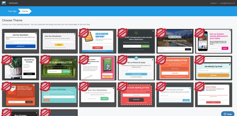
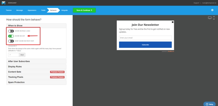
Pick a design, give it a name and a subscriber list then you’ll be taken to an easy to follow set of steps where you’ll set up what it says, how it looks, what information it takes and then the behaviour screen. On the behaviour screen tick “SHOW ON EXIT” and leave the other two options unticked, I’d recommend leaving the frequency to seven days as well.
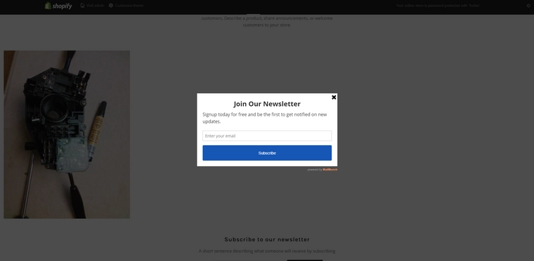
Choose your service provider and connect MailMunch to your email marketing account, then you’re done!
How to set up an exit intent popup with code
If you don’t have a CMS (Content Management System) or your CMS doesn’t have much bells and whistles you might have to add an exit intent popup with code.
To do this you’ll need access to your website’s files and a little bit of technical knowledge.
The library I’d recommend to do this is found on beeker.io, visit this page and follow the instructions on the website.
How you add the code depends on your website, if you’d like help with implementing this code on your website you can get in contact with us.
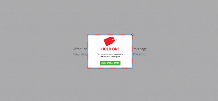
How to maximise conversions on your exit intent popup
It’s shocking how many exit intent popups fail at their purpose.
With a few easy tweaks, a lot of them could go from a poor performer to a top performer.
Sumo’s statistics say only 3 out of 100 people ever have pop-ups with conversion rates over 11%.
How do you become a part of the 3%?
It’s quite easy, by following some basic best practices for your exit intent popup you can be well on your way to being in that top 3%.
Many exit intent popups fail to follow these basic best practices and as a consequence they aren’t getting the results they should be achieving.
I’ve assembled together my list of the best practices to maximise conversions on your exit intent popup.
Implement these, and you’ll be converting a sizeable percentage of people as they walk out the door.
Make it relevant
The more relevant the popup is to the user, the better it performs.
A lot of people present the wrong pitch in the wrong place to the user, making for a guaranteed fail.
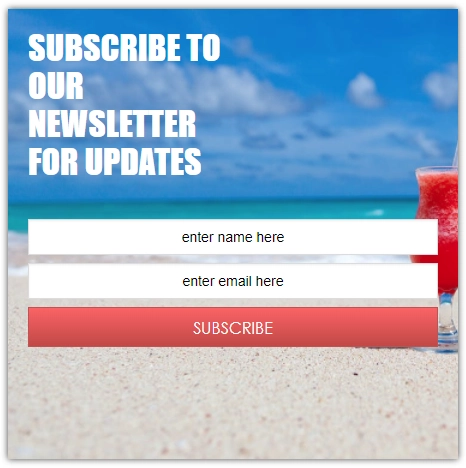
If you’re looking for information on touring in Bali and visit a website, let’s say, “touringinbali.com”, what of these two popups are you more likely to click on?
This generic one:
Or this relevant one:
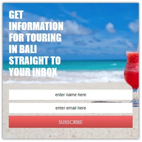
If you don’t feel like the popup is relevant to you, you’re not going to do what it says.
Therefore, the more relevant you make your popup, the better conversion it’s going to have.
Don’t cast a wide net, make your popup as relevant as possible to the visitor so they have the highest chance to interact with it.
Craft the perfect headline
Like with most forms of marketing, your headline is crucial factor to the quality of your popup.
It’s your key sales pitch, value proposition and hook to get the reader interested in using that discount or subscribing to your newsletter.
A good headline comes down to wording and message. Convey why they should be clicking in as few words as possible.
Inject personality
Injecting personality is an effortless way to increase your conversion rate as well as the quality of your brand.
Inserting personality helps to develop a persona, a persona is what can speak to a person to help build a relationship between the brand and the user.
Take a look at this popup from Contently:
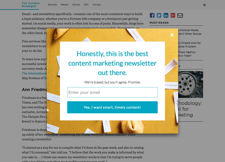
It’s oozing personality and a lot more likeable than a robotic message.
At the end of the day, it’s just asking you to subscribe, but it’s asking in a way that will catch someone’s eye.
Offer something of value
Offering something of value is crucial to a last-ditch effort of reeling a visitor in.
They’re about to leave, if all you do is tell them not to go or fill something out before they leave, they’re just going to be annoyed.
You have to make it worth their while.
Take a look at this popup from Old Navy:
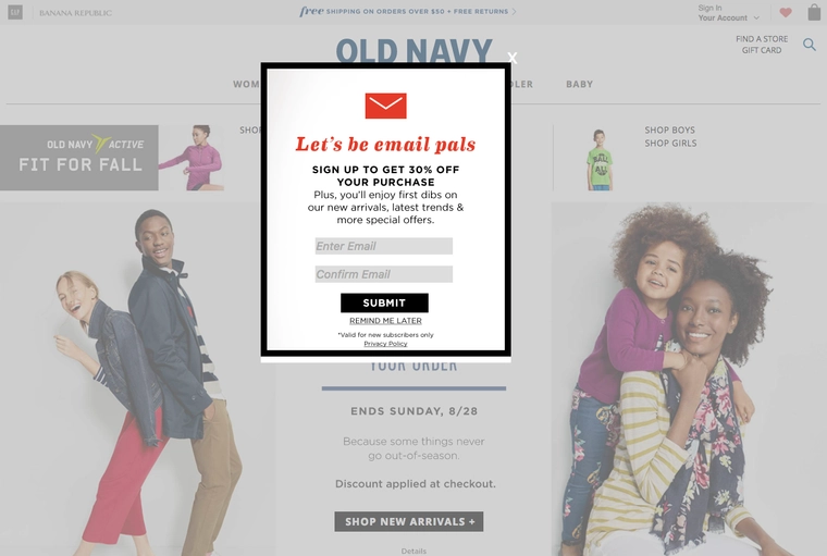
It’s got a clear value proposition: sign up to our newsletter and get 30% off your purchase.
By providing value at the right time you’re tipping the scales in your favour and getting people who would have left back in the door.
If you offer nothing, they’ll continue on their way. Everyone wants a reason to do something.
Create a strong call to action
You’ve got a killer headline, you’re offering something of value at the right time to the right person, what does your call to action button look like?
Your CTA needs to reflect the rest of the popup and help to convince the user to convert.
Esquire does this perfectly:
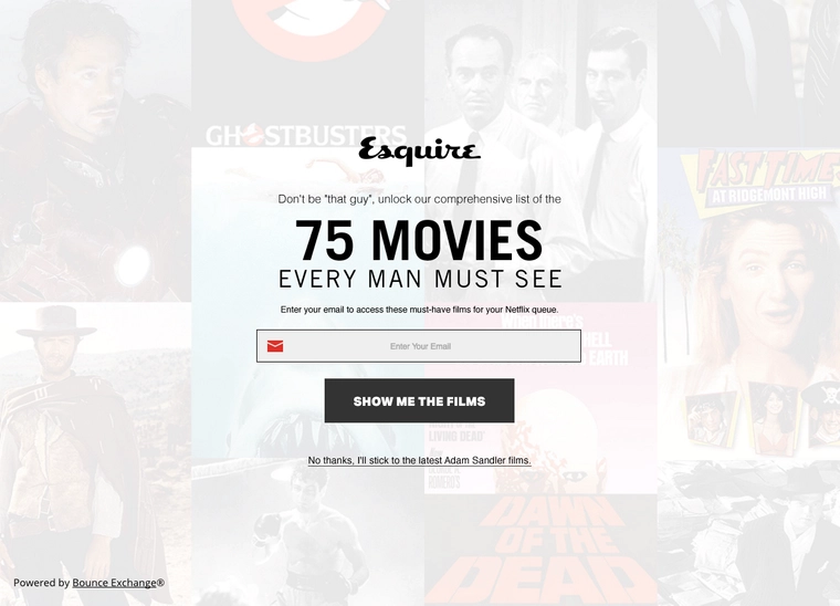
The message “SHOW ME THE FILMS” resonates with what they want the visitor to do, getting them to take action.
Add a negative call to action
Negative call to actions are a strong marketing tactic if not taken too far.
A negative call to action is meant to convince the reader to engage with the call to action, because the negative call to action doesn’t resonate with the reader.
Take ConversionXL’s popup for example:
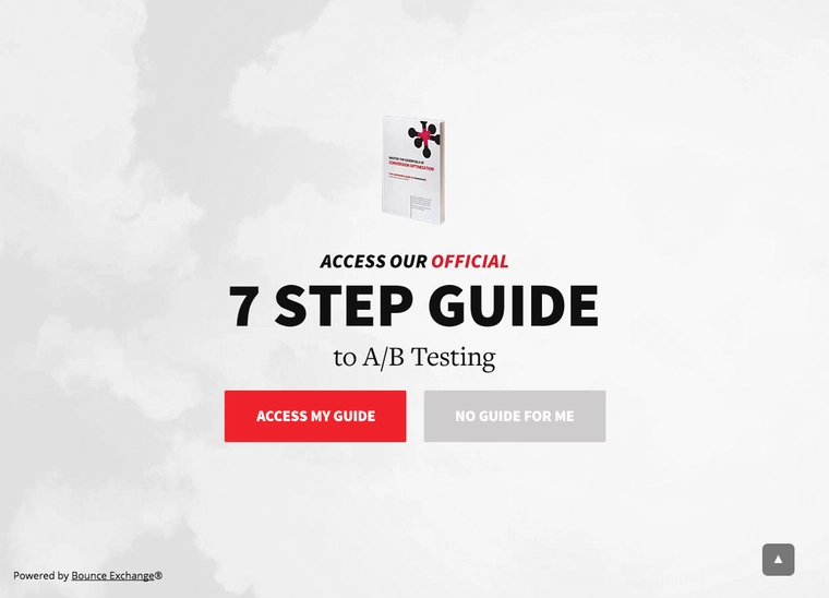
The negative call to action is meant to clash with their persona, without taking it too far. Because the negative CTA doesn’t resonate with their persona, they’re more likely to pick the option you want them to take.
Include social proof
Ciadini’s influence factors (link to ciadini article) are a powerful tool if used correctly, and social proof can be applied to popups to show proof of value.
Help Scout does this by showing how many people are subscribed to their newsletter.
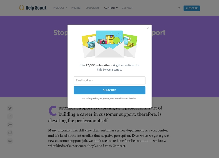
The social proof speaks for itself and helps to convince the reader the value behind the action.
Ratings, testimonials and reviews are effective ways of showing social proof.
Communicate scarcity or exclusivity
By communicating scarcity or exclusivity through ways like a limited time offer or an exclusive offer you’re generating a sense of perceived demand.
Take a look at this popup:
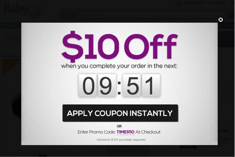
By presenting a limited time offer, you’re creating a limited window of time where they can take advantage of your offer.
In doing this, the offer is perceived to be more valuable and users are more likely to convert.
Include facts
Facts are a fantastic way to convert visitors into customers.
If you know 100% of people were satisfied with their purchase, or your customers increased their sales by 80%, share that fact in your popup.
Facts are a method of clearly communicating the value behind an offer.
Keep on testing
Never settle on the first attempt.
Keep on testing out different strategies, messages and offers on your exit intent popup to optimize the conversion rate.
By following these best practices, you are likely to have a popup performing well above the average, but it’s unlikely you’ll make the perfect popup on your first attempt.
Run a test, record the results, make a decision and repeat.
Conclusion
An average of 40.5% of people that visit your website are going leave after the first page, by implementing exit intent popups you’re making the most out of people leaving your website and turning lost conversions around.
What do you like to offer in your popup to bring potential customers back in?

