How to make your Homepage Convert Visitors into Customers
For most websites the homepage is where the vast majority of your visitors will land on.
Your homepage is your first impression, the foot in the door, and according to Kissmetrics’s metrics on bounce rate, 40.5% of visitors on average will leave after your first page, meaning that your homepage could be your only impression.
Because of this, your best shot at converting customers is by turning your homepage into a mean, lean, conversion machine.
Doing this is easier said than done though, if you don’t have the time to proactively tweak and refine the homepage over the years to perfect the conversion rate, or if you don’t have the money to pay an expert it may feel impossible to get people to convert on your homepage.
It’s a catch-22; you can’t commit the time or money to make visitors convert until they actually start converting sticking you in this slow-crawl feedback loop. How do you break out of it?
There’s plenty of free and easy ways to drive more conversions on your homepage, it won’t turn your homepage into the perfect customer converter but that’s because perfection takes a lot of time, tweaking and research.
What this will do though is start making your homepage convert visitors into customers, and the more customers you’re converting the easier it is to convert more customers through having more data on what works and what does not to make changes backed by facts.
So here’s how you can convert visitors into customers on your homepage today.
Include only one call to action
Just like how too many cooks spoil the broth, too many call to actions spoil the homepage.
If you take a look at your homepage, what is it telling you to do? A lot of homepages fall into the trap of trying to offer too many things at once.
Buy this product, buy that product too, subscribe to this, call this number, sign up for this event — you’re confusing people by giving them too many things you want them to do.
One strong call to action is better than five competing call to actions, always include only one call to action.
The common protest is that not everyone wants to do the same thing when they visit the homepage but remember the golden rule of a conversion funnel:
One page — one purpose — one goal — one call to action
If you need to account for more than one call to action for different purposes, put each unique purpose on their own landing page. Getting conversions on one call to action is better than getting none on five different CTAs.
Keep it simple and use only one call to action on your website.
Keep it simple
Speaking of keeping it simple, that’s a rule that can be applied to your homepage as a whole. That means:
- No essays
- Keep the scrolling to a minimum
Essays have their place in SEO, but their place isn’t the homepage. Most people fall into the trap of wanting to include every detail possible on the homepage, but doing so can hurt your conversion rate, not help it.
2500+ word pages are great for blog posts, but not so great for the homepage where you want to keep it short and simple.
On a similar note, don’t make your users scroll a massive amount to reach the end of your homepage.
Scrolling is okay, you don’t need everything inside the fold, but the longer your homepage is the less people will see it.
Using a tool like HotJar is a great way to tell how far people are scrolling down your homepage; you’ll find that the longer your homepage is, the less people that reach the bottom of the homepage.
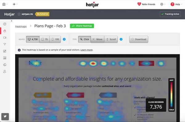
Assess what is and isn’t absolutely critical for your homepage, and redistribute the rest to separate pages.
Perfect content inside the fold
The one thing you can always rely on people seeing in the homepage (unless they leave before your homepage loads) is the content inside the fold.
The fold is the area of a page that is immediately visible when they visit the page.
Because of this, perfecting your fold’s content is crucial to ensuring customers convert.
Usually, excluding the heading, your fold should include 2 key things:
- Your call to action
- Your headline
Your headline should speak directly to your call to action, usually in the form of a unique value proposition, here’s what our fold looks like:

It’s simple, all it does is speak to the main question we think our users want to know, which is how to get more traffic.
Your headline is your one and only shot at conveying why clicking the CTA is worth it, don’t make it boring, and don’t make it difficult to read.
Make it load quickly
In my last point I mentioned that the fold was the only thing you can rely on people seeing in the homepage, but only if they didn’t leave before even the fold loaded.
Loading time is a very make or break factor for your website; it doesn’t matter how convincing your homepage is if they don’t wait for it to load.
According to Kissmetrics article on loading time, 40% of people abandon a website that takes more than 3 seconds to load.
Always aim for your homepage to load in 3 seconds or under.
There are a lot of factors involved in what makes a website slow, but the key guidelines are:
- Keep your web page under 1mb in size.
- Don’t use too many images and keep them all under 250kb in size.
- Don’t use too much JavaScript or other unnecessary code.
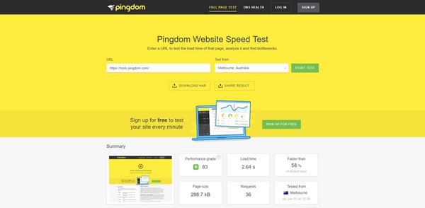
My favorite testing tool for loading time is Pingdom’s website speed test, just plug in your URL, choose a place to test from (choose what would be closest to your ideal audience) and run the test.
Among other metrics you’ll get back your loading time, page size and helpful insights on what you can do to improve your loading time.
Google’s PageSpeed Insights is another useful tool for testing your page speed.
Put your url in, hit analyze and you’ll get back a list of recommendations on how to improve your page’s loading time.
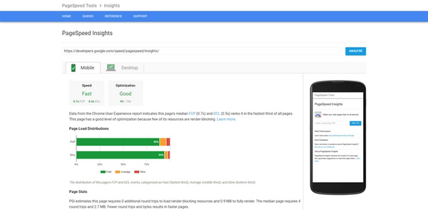
Some changes may require technical intervention, but it’s a great starting point to reducing the load time of your homepage which in turn reduces the amount of people that will leave before it loads.
Conclusion
Your homepage is a very important tool to turning website visitors into customers, don’t let it go to waste and lose customers. Making your homepage convert is easy, and doesn’t require a lot of time or expertise.
- Include only one call to action.
- Keep it simple.
- Perfect your content inside the fold.
- Make it load quickly.
Follow these four tips and you’ll be converting visitors in no time.
What are some of your favorite tricks of the trade to make more people convert on your homepage?

